

Caitlin Dickinson, mapping expert LSA Technology Services, finds joy in learning and discovery, and in using tools to create maps that solve problems. In this MITN interview, she offers tips, tools, and best practices for researchers and fellow map enthusiasts.
Tell us about your role as a Geographic Information System (GIS) consultant at LSA.
I assist LSA faculty, staff, and students with spatial data collection and analysis using GIS software. This work takes a lot of different forms—sometimes it’s writing code to automate analysis, making a map for publication, or teaching and guiding faculty members and students on how to use the software or create their own maps. I also advise on best practices for field data collection using a suite of tools and mobile apps in the ArcGIS platform, an online mapping tool. I also can build custom web applications for researchers who want to display their interactive maps online and share them publicly.
The data and projects I get to work with tell stories about the relationship between humans and the landscapes we live in—whether it’s how social patterns play out across space, or quantifying environmental stressors. The applications of GIS are endless, and I love the variety.
How did you get into this type of work?
I took a GIS course during my first year at Mount Holyoke College—and I was hooked from the beginning! I had never taken a class like that before or been encouraged to think so spatially, and I loved the problem solving that was involved. I was fortunate to work on a summer project about how the hemlock woolly adelgid insect was decimating the hemlock trees in the northeast. It was a wonderful hands-on introduction to the field!
What are the notable conferences or seminal texts you recommend?
The Esri User Conference in San Diego is huge, and a great place to connect with 17,000 of your closest GIS friends while learning about the latest GIS technology trends. The Annual Association of American Geographers is a good place to learn about geography research, while the North American Cartographic Information Society’s annual meeting delves into the art of map making.
I recommend reading “Cartography,” by Kenneth Field. It’s fascinating, even for those who might be new to GIS. It demystifies maps by breaking down mapping concepts and strategies, and sharing best practices for building and reading them.
Kenneth Field also has a great blog post about mapping responsibly. This is especially important in the age of depicting delicate political discussions or health issues. Maps are powerful communication tools, and we should all map ethically and responsibly!
What’s the most interesting or impactful map you’ve ever created?
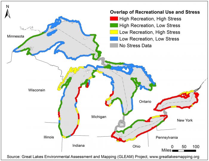
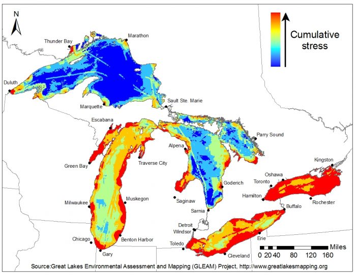
At the School of Environment and Sustainability (SEAS), I worked on the Great Lakes Environmental Assessment and Mapping Project, where we mapped 34 ecosystems stressors, such as nutrient loading, toxic chemicals, and invasive species, among others across all five Great Lakes. We then looked at the spatial correspondence of stressors with ecosystem services, such as beaches, fishing areas, and boat launches to help inform where restoration dollars should be directed.
What is the most difficult/challenging mapping project and how did you solve it?
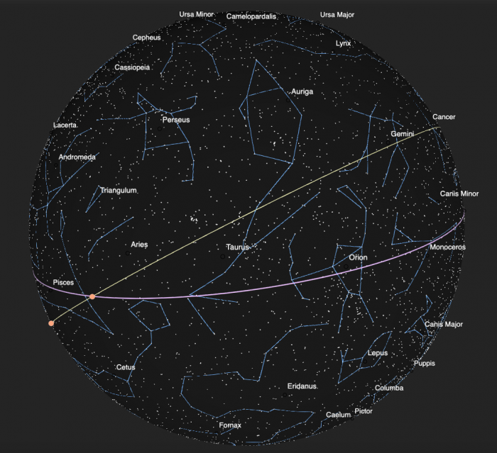
One of my more recent projects that was difficult, but rewarding, was mapping the stars as they would appear to philosophers and astronomers in ancient Greece, namely from the perspective of standing outside the celestial sphere, looking back at the earth. It took me some time to wrap my mind around it conceptually, and to find the best way to use GIS software to display the information. I ended up creating a web application, pictured below.
Which resources do you recommend for someone looking to develop their own maps?
U-M has a site license to the entire ArcGIS Platform (online, desktop, mobile apps, etc.), and all faculty, staff, and students can access it. ArcGIS Online is a great place to start for beginners.
There is an abundance of freely-available data in the Living Atlas, including templates for apps to share your creations. No coding skills are required. For researchers looking for something beyond this, my colleagues and I can give guidance on how to start with desktop GIS software, or create custom web apps for those with specific design requirements.
Several online tutorials are also available on the Learn ArcGIS website, and a number of workshops are held on campus each semester by LSA Technology Services, CSCAR, and the Clark Library (the map library in Hatcher).
What else can be created from data?
There are so many things that can be created! A simple print map, an interactive web map, dashboards that update in real time. You can create a survey to collect data, or create a StoryMap to embed interactive maps in a narrative format (i.e., scrolling) that’s effective for public outreach and sharing your research.
Check out the U-M ArcGIS Online gallery to see some examples, such as the “Mow Town” StoryMap, our ArcGIS user dashboard, and a citizen science survey to collect information on balloon debris around the Great Lakes.
What are your favorite ways to stay up-to-date with GIS technology tools?
There are some great GIS user blogs, such as John Nelson’s “Adventures in Mapping,” and I frequent GeoNet, the online Esri user community. I like to attend MOOCs (Massive Online Open Courses). I network regularly with other GIS employees across U-M’s campus which includes the GIS Community of Practice. There are a lot of additional GIS resources at U-M.
What is a common design challenge you face, and how do you overcome it?
The most common and ongoing challenge is how to display multiple pieces of information on the same map without it being overwhelming. There are a lot of great “smart mapping” techniques in ArcGIS software to help with this. One solution is to use bivariate mapping, which uses color, size, and transparency to illuminate relationships between multiple categories or variables. For example, one could look at the relative predominance of republican and democratic voters by county by using intensities of red and blue, or the relationship between agricultural productivity and food insecure areas using a grid of colors to show “high productivity, low food security,”, or “low productivity, high food security” areas.
How many atlases do you own?
I own several road atlases because I prefer them to GPS. I have a lot of books about maps, and have several USGS topo quads as wall decor!
What do you enjoy most about your job or what gives you the most satisfaction?
I love the variety of the work. I learn something everyday—I might learn a new skill, or about some one’s fascinating research, or find a new way to analyze data. There is a lot of room for personal and professional growth with my job.