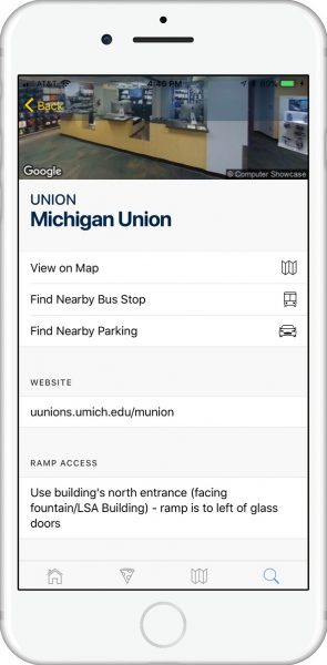
 The Michigan App has been available for limited beta for a little over two months. The development team took that feedback from testers and has now launched the public beta to all U-M staff, faculty, and students. The new app features a completely redesigned interface that helps streamline daily activities and supports success towards academic and personal goals for students, faculty, and staff. Some of the recently added features that received praise during the beta include:
- Improvements with performance
- Persistent log-in
- Display of personal class schedule
- Location-based bus stop and parking information in Building search
- Person search (MCommunity) for students, staff, and faculty
- Crime alerts issued by U-M
- Campus event feed
- Dining hall location and menu updates
The new Michigan App uses cloud services to get new features and fixes to users more efficiently and with little disruption. Many students, faculty, and staff say they appreciate the more user-friendly approach. David Nguyen, an undergraduate student in the School of Information, agrees: “I definitely love that the new app looks more like an iPhone app rather than a website. I’m a huge fan of it!”
Will Burns, the ITS Mobile App Development Team manager, explained that the new app’s development focused on user experience and feedback. “The new app was designed from the ground up. We asked our user community for ideas, and focused on building the best features to help navigate the day on campus. We’re looking forward to continuing to grow the Michigan App via user feedback every month.”
Download the Michigan App Beta today and let us know what you think! (Submit feedback via a link at the top of the app homepage screen.)
