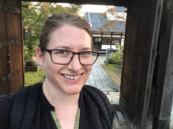
Jackie Wolf is a web project manager and an user experience specialist for Michigan Medicine Department of Communication. Primarily she and her team build and support websites for Michigan Medicine. She also ensures that the web technology is robust, flexible, accessible, and secure. Collectively, the team gathers data to look for lessons about how frequently the content is being looked at and for patterns in browsing, and then make recommendations to either curate the content or display the content a little bit better.
Tell us about a usability study you worked on.
We conducted a user experience study to learn what medical students are looking for on websites when they research where to go for their next level of medical training called residency. It’s very competitive, so organizations all over the country want to know how medical students are making decisions.
We also wanted to know how this decision making differs from their experience when they were choosing medical schools. We found that the patterns were similar, but medical students are not spending very much time on websites because they’re so, so busy. For us that means we should start paying attention to what we’re highlighting.
It was really fascinating to discover the types of information the medical students were interested in. As expected, they wanted to know what the next few years of their lives were going to look like; rotations and vacation time were top of the list. But they were also really interested in understanding what support they would have during residency, which is historically quite rigorous.
Medical students look for diversity, equity, inclusion, and mental health support when searching for a residency program website. Students want to know if their faculty and teachers will look like them in order to learn and grow in a diverse environment. They fear the support won’t be what they need if they don’t see representation.
As a result of how demanding their job is, they fear physician burnout.
What are some website challenges you encountered?
The challenge is bigger for programs that prospective medical students don’t know about. Part of our goal in the study was to understand how medical students hear about residency programs.
We learned through usability studies that medical students hear about residency programs from different places: U.S. World & New Report, mentors, or from the residency program itself. Some may follow Reddit threads specifically for medical education. It’s really fascinating to see the different ways that they get their information.
How did you use data from usability studies to make decisions about how web pages are set up?
We look at how to build bridges for users. It’s our job to find a way to make it easy for users to get what they need.
For example, if a user lands on a research page but really wants to make a clinical appointment, we can use the information collected from usability studies to discover the best way to get them the information they need. It’s not the user’s responsibility to know the difference between a research page and a clinical page.
Typically, patients aren’t going directly to Michigan web sites, they are going to Google first and searching for specific terms. They might not understand the bifurcated environment we have between research, education, and clinical, and when they land on a page they automatically assume it’s for them.
Through analytics about searches people conducted, we were able to determine that some patients were actually going to a site that was meant for research. So we did a study to understand why and how they are coming to the site, and what happens next for them when they realize they aren’t in the right place. We started to understand that most people are entering a website, not from a homepage, but from Google using very specific diseases or conditions as search terms.
How do patient volunteers contribute to a usability study?
My team and I reached out to the Office of Patient Experience whose mission is to improve the experience of our patients and families at Michigan Medicine. Because they routinely work with patients, we asked them for help in finding patients to participate in a study about navigating online digital spaces for receiving health care and doing research.
When working with the patient volunteers we had them walk us through three different tasks that had parallel sites; one that was clinically focused and one that was academically focused.
When patient volunteers landed on the different websites, we asked a series of questions and prompted them with different scenarios that they were required to do on all the sites.
We would observe their search patterns such as what they’re searching for, what information is gathered, and are they reading through the information or just scanning for keywords.
A section of the questions required us to observe if they were thinking out loud as they scanned and searched the results. When they landed on the page, we examined how they scanned the page or how they viewed that page, and how they decided if that’s actually relevant information for them.
Before joining the user experience team, you earned a master’s degree. Tell us about the time you spent in India as part of the program.
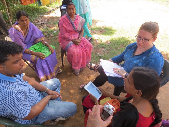
Before I joined the web team, I earned my master’s degree from the U-M School of Information. As part of my studies, I spent some time in India as part of the Global Information Engagement program. I was there with two other master’s program students. One student was doing his master’s in health informatics degree, and another one was earning her public health master degree. We were working on essentially what became building an electronic health record (EHR) in Western Bengal in two months. There were some interesting challenges that the clinical staff faced that were not directly related to the EHR such as reliable telephony and intact bridges during the rainy season. My time there really helped me to consider my customer’s point of view and to be careful about my own assumptions for solutions.

